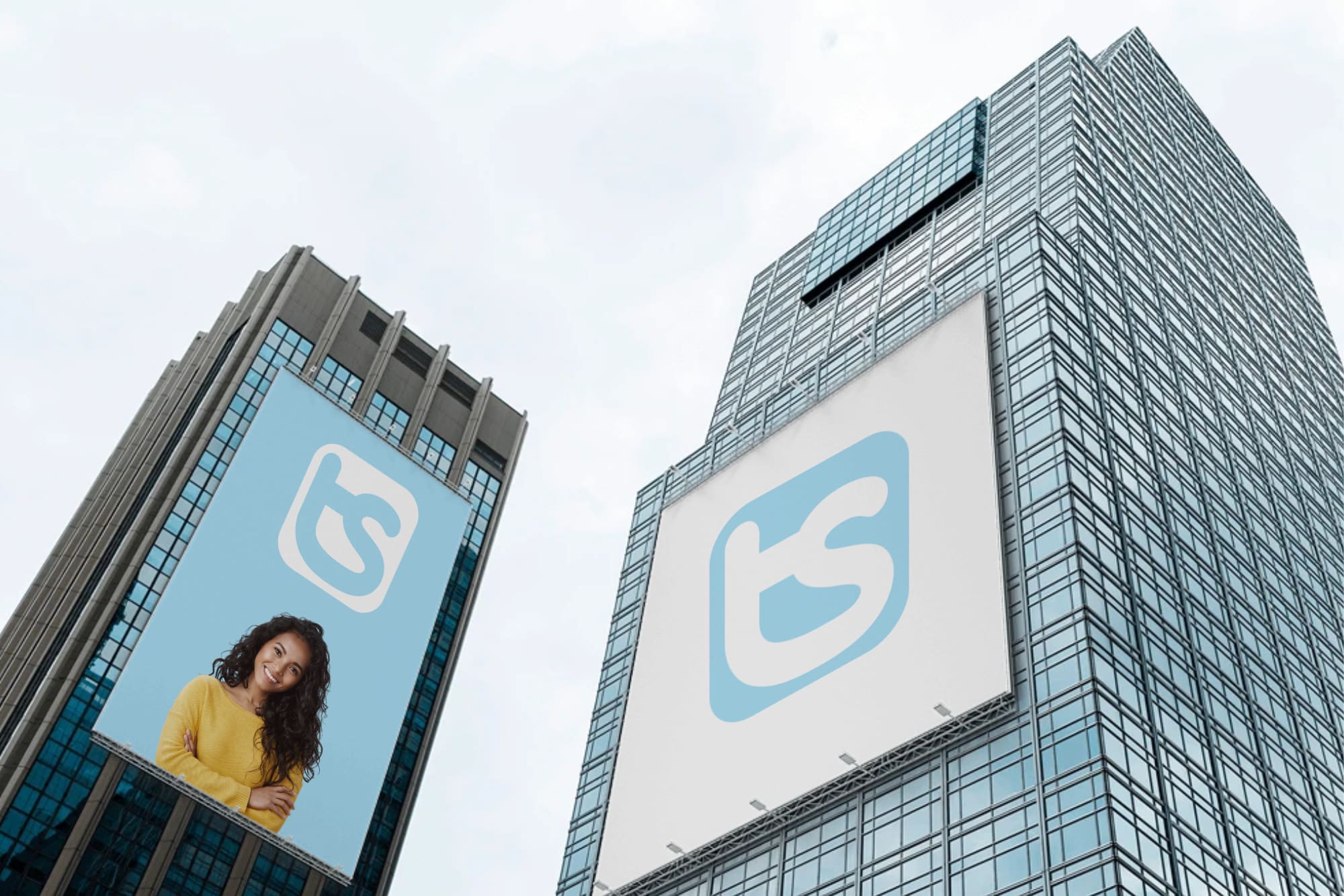
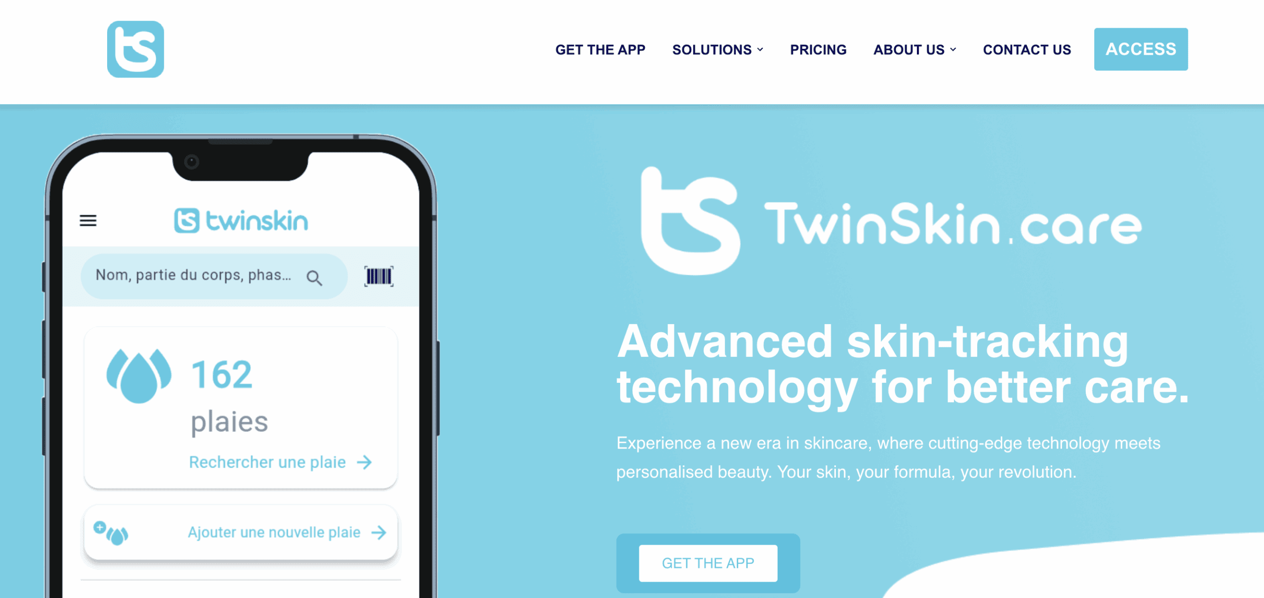
Creation of brand visual identity, logo design and digital universe for TWINSKIN.CARE, an innovative Belgian application in the SkinTech – MedTech sector, enabling wound monitoring and skin condition tracking. Designed for healthcare professionals, this advanced digital solution facilitates documentation, analysis and collaboration around dermatological care.
The TwinSkin.care Design Concept
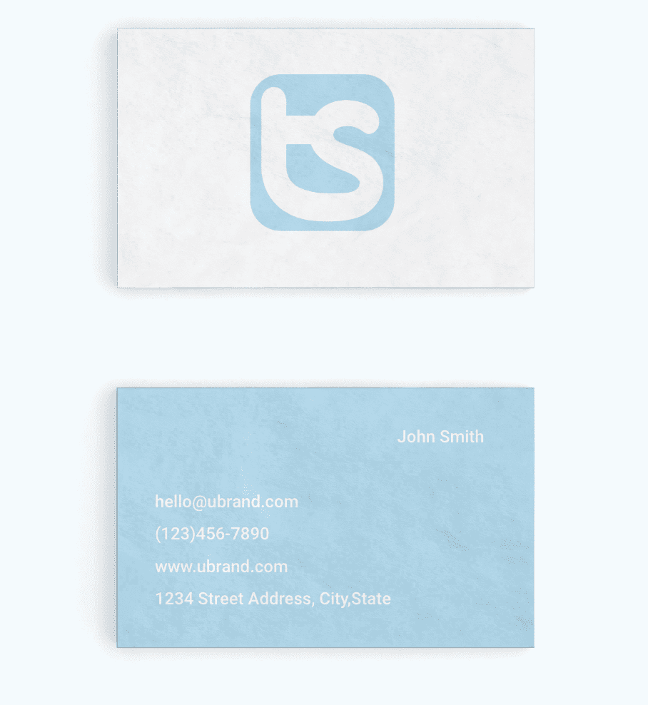
A clean design with rounded curves, suggesting gentleness and protection, perfectly aligned with the dermatological care universe for a MedTech / SkinTech app company. The rounded forms and light blue background evoke a caring, reliable and reassuring approach. It was built around the “Aristotelica Family” typography, carefully modified in our design studio to deliver a unique rendering. Concept & Creative Direction: Pascal Wouters from L’AGENCE DE PUB.
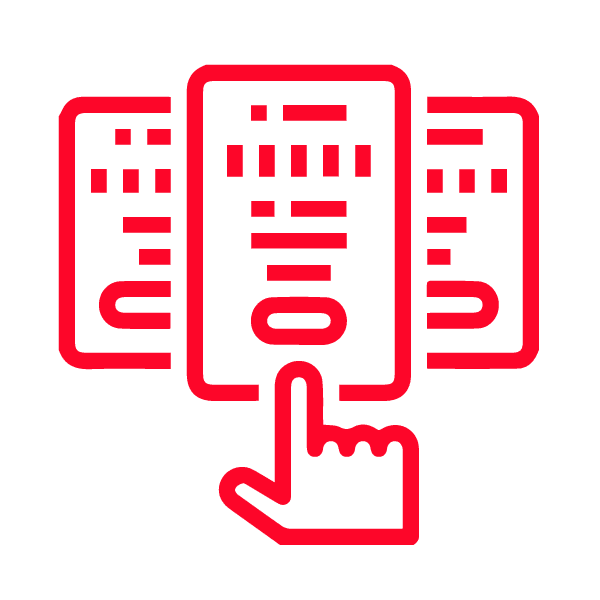
Design Graphic Elements
The initials “TS” harmoniously merged, reinforcing the idea of symmetry and visual fluidity.
Logo Feel:This minimalist logo inspires simplicity and modernity through its clean design and use of a soft, rounded typeface. Technology or Health: Light blue is often used to represent technology, health or cleanliness, which could be interpreted as a modern, user-oriented tool or service. Brand Identity: The use of the letters “ts” as the central element provides a strong sense of identity that’s simple to remember.
| Advanced skin-tracking technology for better care.
Lorem ipsum dolor sit amet, consectetur adipiscing elit. Ut elit tellus, luctus nec ullamcorper mattis, pulvinar dapibus leo.
We use cookies on our website to provide you with the most relevant experience by remembering your preferences and repeating your visits. By clicking on "Accept all", you consent to the use of ALL cookies. However, you can visit “Cookie Settings” to provide controlled consent.
This website uses cookies to improve your experience when browsing the website. Of these, cookies categorized as necessary are stored on your browser as they are essential for the functioning of basic functionalities of the website. We also use third-party cookies which help us analyze and understand how you use this website. These cookies will only be stored in your browser with your consent. You also have the option of deactivating these cookies. But disabling some of these cookies may affect your browsing experience.
Necessary cookies are absolutely essential for the website to function properly. These cookies ensure basic functionalities and security features of the website, anonymously.
Functional cookies help to perform certain functionalities like sharing the content of the website on social media platforms, collect feedbacks, and other third-party features.
Performance cookies are used to understand and analyze the key performance indexes of the website which helps in delivering a better user experience for the visitors.
Analytical cookies are used to understand how visitors interact with the website. These cookies help provide information on metrics the number of visitors, bounce rate, traffic source, etc.
Advertisement cookies are used to provide visitors with relevant ads and marketing campaigns. These cookies track visitors across websites and collect information to provide customized ads.


